When starting to research online for design ideas for my information pack, I already had a few concepts in mind. Ideally I would like my pack to appear as organic as possible, relating closely to the experiments I carried out with my ink when I created my own using leaves. I think if I make my pack as eco-friendly as possible then I am portraying a sustainable idea and this will hopefully encourage other graphic designers to work with sustainability in mind too. Packaging is something I am strongly interested in still, and so I think it would be ideal if I could incorporate some form of packaging within my design.


Source
I also quite like the idea of creating an information pack with different compartments to put separate materials in. It would be strong way of presenting information and keeping it organised. Again, I love how brown stock has been used as it gives an organic authentic feel.

Source
This is a clever concept which I could certainly take inspiration from. I love how all of the boxes fit together to create a set of information. I could apply this to my design quite easily, however I'm not sure I want to make it as packaging based.

Source
I really love this design. The concept of having a bag containing all of the information which could perhaps be a set of informative books, as well as having a small pocket on the side of the bag. I don't know whether it would be beneficial to me having this pocket though, because it would really serve a purpose.

Source
This is very closely related to the Winnie The Pooh set of books I have posted as primary research. I think it is really clever the way the different elements fit together to create the whole design. I could certainly take inspiration from this by perhaps creating something which encompasses all of the different elements of print and having them fit together like a jigsaw.


Source
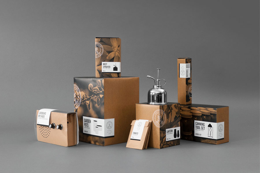
I think I prefer this set of boxes in comparison to the one I posted earlier. This is because the boxes are a lot more ordered and organised. I also love how info graphics have been incorporated to inform the user about what each of the boxes will have inside.

Source
This is a clever way of incorporating packaging in with editorial work. I like how the product inside is subtly placed and acts as a surprise element almost for the recipient.

Source
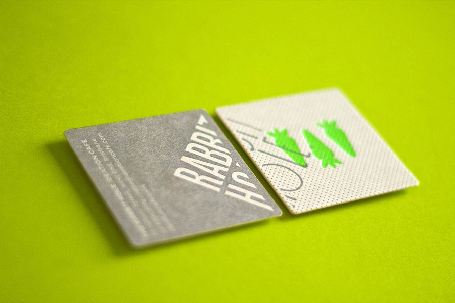
The thing I like about this design is the fact that the designer has used the same stamp on each of the boxes to create a set of products. This is such a simple idea which can easily be applied to a variety of materials. I could easily do this with my own work by creating a set of illustrations and use a stamp to print on to the materials. Alternatively I could emboss now that I have experimented with it. However I need to experiment further as I didn't achieve the results I had hoped for.
Source
In a similar way to the Winnie The Pooh collection I have, this box encompasses a set of books which all work well as a set, as they are produced using this brown stock, with a selection of primary colours used to differentiate one from the other.


Source
By using a prism shaped container here, the designer has managed to design something which is interactive and aesthetically striking at the same time. I think it is important to get the balance right with this brief as I need to ensure that I am portraying the information well and not getting too carried away with any complex designs. I could quite easily take inspiration from this however, and create a box which could resemble a book and have it so that the consumer would open it up to reveal lots of loose leaves of paper with information on.

Source
I would absolutely love to create something along the same lines as this example of print below. I love the hand rendered illustrations and think they add such a personal touch to a piece of work. This is an area I would love to improve anyway, so by creating intricate illustrations for my information pack I would be strengthening a skill as well as producing a desired outcome. I also think I could take inspiration from the fact that it is a set of envelopes all tied together with some string.
When relating this to my own design I could create separate envelopes to separate the information out and they could all be bound in a certain way, perhaps by tying them together. They could either all form the shape of a leaf, or I could be even more inventive and design them in the shape of something relating to that print process. So for example, if I was writing about digital print, the envelope could be in the shape of a printer. Or if I was wanting to laser cut then you could open the envelope in the same way you would open a laser cutter.

Source
This is a unique idea incorporating packaging with editorial design. I absolutely love the idea of having separate packages of information stored within one container. When you reach the final box on the inside it could be revealed to the audience that the produce has been made using the following eco-friendly processes.

Once again, this is a unique and individual way of packaging information. The recipient has to open the parcel up and reveal the information inside. It would be quite a strong concept to use with my work if I had some information on the inside of the sleeve as well.This would be a clever way of separating information up.

Source

Source
The reason I have included this on my initial research is because I love the illustrative style. I love the concept as well, this could be applied to my work in some way by revealing either an object inside or just cards with information on.
Source
Below is an example of a print manual which has actually already been produced. I could create something exactly the same as this, but this wouldn't be unique and wouldn't be my own idea. The layout of this publication works well and is easy to understand, however if I am wanting to create something with a bit more of an organic feel, then this wouldn't be the look to go for. On the other hand, for a more commercial route, this would be ideal.
Something which is really important to consider whilst I look through all of this research, is the cost of reproducing the product I create. In the past, during first year, when I created the Pooch Pouch, I made that with the product placement in mind, and could see it on the shelves in Harvey Nichols. The way in which I produced it however, wouldn't have been ideal in the real world. I would have had to reproduce it using die cut machines and litho print, however these are things I was unaware of at the time. Therefore, in this situation, I need to consider every avenue and make sure that I am covering everything that I need to in order to produce a successful resolution to the brief.


Source
I think this is really clever in the way that the designer has incorporated an underlying humerous theme in to their work. This doesn't always work and isn't always successful, as everyone has different ideas of what is funny and what isn't. On the other hand though, the fact that they have gone that extra step further means that they have managed to create something which is personal, unique and one of a kind. This is important to me.


Source
This is clever, how the packaging for the book has been created by taking the idea of printer paper and how that it packaged. Something as simple as this can be just as effective, and it is often the simple things that create memorable design. I think it is important that I remember this as I can easily get carried away with creating complicated crafted work.


Source


This, in my eyes is a very simplified guide to typography, but I think it has been really cleverly designed. I feel as though I could take inspiration from this by including illustrations inside my print information pack, but I would have to define my audience first, otherwise some of the information may come across as being a bit insulting. I also love how the book has been used to create an exhibition where hundreds of people could get involved and actually interact with all of the print outs on the wall. I would love to create something interactive like this, but it all depends on which route I decide to take, and whether or not my initial idea of creating an information pack about sustainable print works out.


This is an example of a very fiddly, crafty piece of design work and it would have to be designed with a very specific audience in mind, as not everyone would want to engage in something so complicated. It therefore may be a bit too presumptuous to design something similar to this, because it may not be a success and would also be really hard to mass produce.
Source
I think this set of promotional materials is outstanding. It has instantly given me an idea and I can relate it quite closely to the Chanel blotter I was given in John Lewis not long ago. If I was to go down a more crafty route I could certainly take inspiration from this work. I could create book marks which essentially pop out in the same way as this, to give it a bit more of an interactive feel. Whether or not this is necessary I am unsure but there is no harm in experimenting.
I love the idea of creating an information pack for a really bespoke, particular audience. However, realistically, if I am wanting to be as eco friendly as possible, this wouldn't be the right thing to do. I found this example below though, where someone has debossed in to leather and i think it looks lovely. It has worked really well and the result is so crisp. I think this is something I should keep in mind for future projects but perhaps not this one.
Source
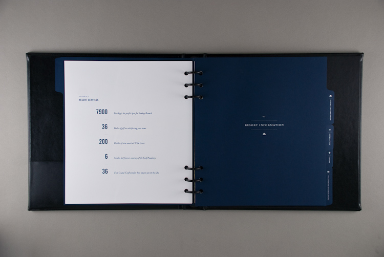
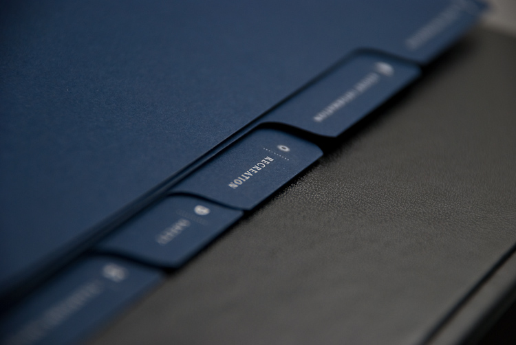
Once again, this is a very high end product to produce. I think aimed at the right audience, this could work really well, as it has quite a corporate feel to it. However, with sustainability in mind it wouldn't be idea to create something which needs an outer cover, the stock for the pages inside and a plastic ring binder.
Source
I could quite easily go down the route of designing something similar to the book shown below. However to produce a book like this, it will have been quite costly and not very efficient where time is concerned, this is because there are a lot of small parts to the book which will have had to have been printed separately.


use inks from food perhaps to print on to each page to make it more eco-friendly and ethical whilst still being professional too. Illustrates how to always look at the alternatives and consider your options before going with the easier option you are most familiar with.
Source


Basil Leaf Package can be re-used to grow basil.
Punch holes for draining water
Box shown with breadstick


Source
I could experiment with cutting in to leaves in a similar way to this example, however I am not sure whether this would be necessary. If I am wanting people to turn over a new leaf and become more sustainable designers, then I need to look at the situation in a broader scale and not just how we can reuse objects in nature to create certain designs. By doing this I will be able to gather the necessary information that I will need.
If I am aiming my print pack at businesses who use printers to print their promotional materials, then I need to think about what is going to encourage them to change to use printers that use vegetable based inks for example, and not laser cut in to leaves just for the sake of it.


This is another very simple yet effective idea. I could easily create a cover which is similar to this and name it 'take a leaf out of my book' or 'turn over a new leaf'. I am not sure how necessary this is and could quite easily be getting too carried away with the concept as opposed the actual content at this stage. The content it the most important part to consider really and I need to find out whether people would find it interesting, being told how to be more sustainable, or whether they wouldn't take any notice.
Below is a set of different advertisements which were created to promote sustainable and eco friendly cars. I think it is really clever the way they have maintained consistency throughout by using the photographs of the leaves and a simple quote at the bottom of each of them. I could easily create some sort of campaign off the back of this book as well, but I am not sure whether I would be able to create something which hasn't been done before, as sustainability is a constant issue.


I came across this logo which I felt was extremely relevant to my work. If I need to develop my own logo for this information pack, then I could take inspiration from this design. I like how the leaf has been used to create the shape of a flower whilst at the same time all of the other leaves are representing hearts which gives off a positive feel. The only way I would possibly need to create my own logo however, would be if I was to create my own brand or perhaps my own non profit governmental organisation who send out information to people about how to be more sustainable with their print decisions.
Source
This is a really strong idea and I like the idea of 'taking a leaf out of my book' and then providing the audience with a different fact about how to be more sustainable. Perhaps not literally creating pieces of paper in the shape of leaves like they have done here, but considering the concept and applying it in a slightly different way.
This is a really strong idea, taking the paper packaging which has got seeds in it, and reusing the packaging to create your own plants. I could reuse my information pack by encouraging the reuse of the seeds provided in the back, and encouraging people to use the seeds to grow and create their own ink. This is getting a bit crafty and complicated though and i am not sure how many people would actually do this.


Source
I quite liked these book covers which were designed with the use of leaves on the front of each one. I could photograph leaves and other relevant objects to incorporate within my design. This would add quite an authentic and organic feel to it. I may however be concentrating on the idea of 'turning over a new leaf' a bit too much here though and taking it a bit too literally, the audience may actually get a bit confused about the subject matter of my information pack if I focus it too much in this way.


Source
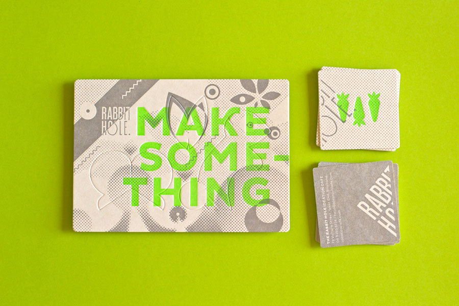
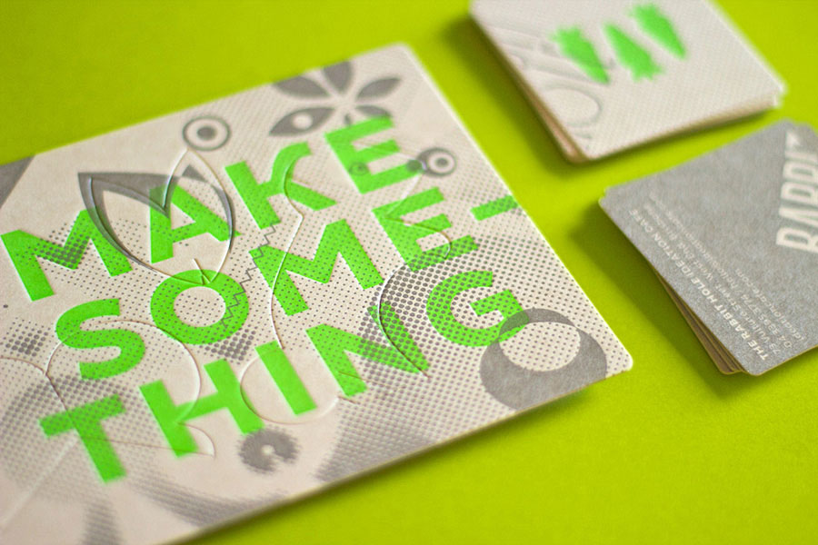
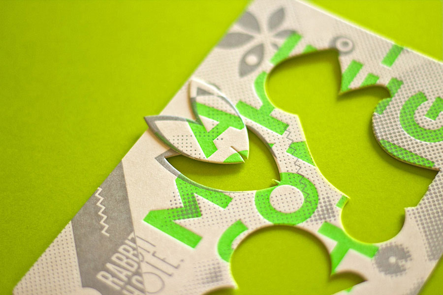
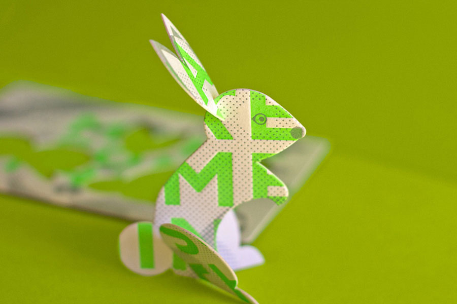
I could easily adopt the idea of using paper cut pages to illustrate different forms of print. Each page could reveal more and more information, cutting away different shapes which reveal the outline of a printer perhaps, or even a screen printing bed. There are lots of possibilities, but in terms of mass production and cost, it would be quite expensive to mass produce.


Source
Although the content of this publication isn't relevant, I love how the information has been presented. By simply using a plain white box filled with leaves, the title 'Autumn' is effectively illustrated. I think if I was to create something like this it would have to be aimed at children, however they wouldn't necessarily keep this in good condition so it is worth considering whether or not it is worthwhile to create.


No comments:
Post a Comment