This is an ongoing post of my postcard research for the images I find beforehand and throughout my design process. Once I have more of an idea of what I am doing I am sure it will become clearer as to which designs have influenced me.

Although I am not keen on the composition of this design, I like how colour has been introduced and think it has potential to be a successful postcard.

This relates directly to my circular shape theme. It has a vintage feel to it and the colours together create a very striking design.

Although the illustration could be improved upon, this is quite a comical and quirky design. I particularly like how the text is aligned vertically on the reverse side to separate the address and stamp from the writing.

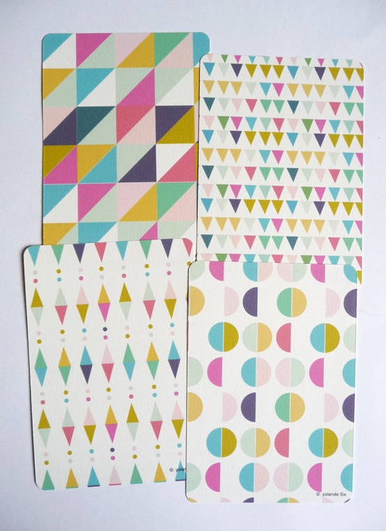
I think all of these colours work well to create a striking geometric set of designs. I could create something along the same lines for my postcard designs if I could find an image suitable enough to use.

It is obvious that the designer has spent a lot of time creating all of these designs. The papercuts are so fine and intricately designed, allowing the design to stand out and look individual.

Postcards such as this one I prefer much more as it has been created my simple image manipulation and the application of two words, yet it still remains powerful and is a strong design.

Once again with this postcard I think it works really well with the overlay of text. I think it could have worked even better without the introduction of the red circle with the 'W' in the centre of it.

The neutral tones combined with a hint of bluey green work really well to create a striking postcard.


I think the designer has used too many different variations of type here, making it hard to distinguish the most important piece of text. I think the stock and the colours used work together however.


I found some designs which very closely relate to my theme of a circle. This one below is a simple architectural photograph which has been cropped slightly to make it more visually enthralling.


This is another circular design but I feel it has been overcomplicated by the misuse of type. Too many typefaces are involved and it ruins the quality of it slightly.


I love how such a simple image can form such an interesting postcard. I definitley feel as though the simplist designs are the most creative and effective. There is no point in cluttering a design for the sake of having more design on there.

No comments:
Post a Comment